 I just completed a redesign of a lovely, small home in the country. From the outside it was very unassuming and the inside, well it just needed some love and attention.
Sherri, the owner told me she wanted a home that gave her a sense of peace and made her friends and family feel welcome when they visited.
She and her husband had done the cabinet work in the kitchen earlier, but had no idea where to start with furniture and décor. They were ready for their home to be all grown up and a lot more functional.
Check out these amazing before and after pictures to see how good design can make every inch matter.
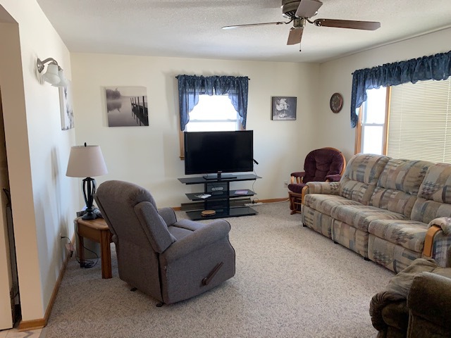
Problem #1 Long Narrow Room
Do you have a long narrow living room space? It can make furniture arranging difficult. For this couple the way they had the furniture arranged meant that one person had to sit farther back in the room than the other, making it awkward for conversation (and sharing popcorn).
Problem #2 Outdated Furniture and Window Covering
As as designer I see this situation in nearly even home I go in to. It’s the number one reason people hire a designer to begin with. They’ve lived with these pieces of furniture for so long they get kinda “stuck” with them. But there comes a breaking point where they finally say, okay, it’s time to have a grown up room.
Problem #3 Lonely Artwork
I have a close friend who lives by the rule, “Where the nail is, there goes the picture.” I wonder if you’ve even done this too. You want to change out your artwork, but you’re afraid to put a new hole in the wall to hang it properly. So instead you just use the nail that is already there. You’ve done this haven’t you? Haha you are most definitely not alone. My friend has since accompanied me on an design project and has seen the beauty of confident nailing. What’s the worst that can happen? You have to fill and touch up a little paint? One of the tricks I use to help nail with confidence is to place painters tape and cardboard templates cut to match the size of artwork you are about to hang on the wall before nailing anything. That way you know exactly where the nail is going to go with confidence.
And Here’s the After…
____________________
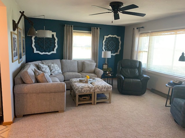
Solution #1: Flip it
By flipping the TV to the other end of the room, we were able to maximize the seating area with a curved sectional. Also, by flipping the sofa to the other wall, it opened up the view out the window. What’s my favorite thing in this room? The grouping of four square ottomans! They are the perfect size to just pull over and tuck under your legs AND they add four additional seating spots for when family comes. They are just so darn cute I can hardly stand it. :).
Solution #2: Bring in Custom Design
The window treatments bring tons of class and sophistication to this charming country home. Woven blinds added texture and the side panels bring some height to the long room. Adding custom drapery always brings a sense of a finished, polished look and are worth the investment.
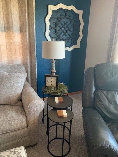
Solution #3: Repeat the Color
Hello color! The blue wall is color matched to the one we did in her kitchen and it’s become one of my favorite blues. Updating the artwork and wall sconce polished off this cozy corner.
Next Up… The Dining Room
____________________
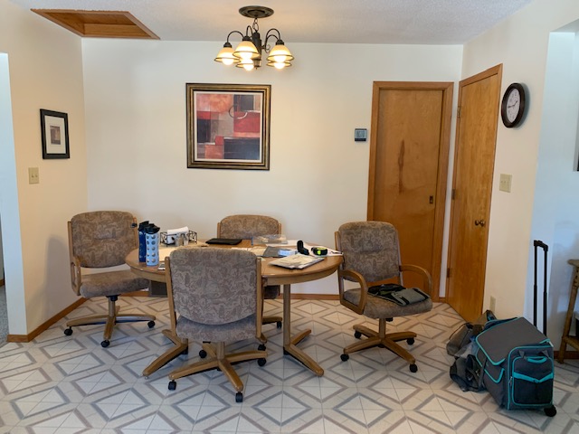
Before Picture- Dining Room
Problem #1: Needs Color and Impact
The white walls lacked character and interest.
Problem #2: Light fixture too high and not centered over the table
The overhead light felt disconnected from the dining table because of its style and shape.
Dining Room After Pic’s
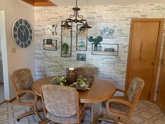
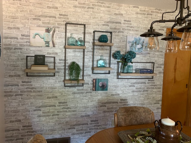
Solution #1: Added Brick Wall…
Visually the brick made this wall really stand out. What a difference right? Guess what….it’s wall paper! I absolutely love this brick look without the cost and mess. It adds tons of charm and warmth to the dining area.
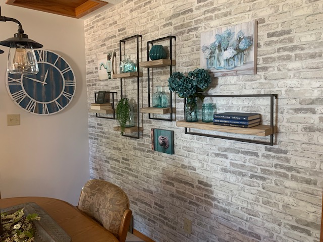
Solution #2: Bring in Lots of Wood and Metal
Adding rustic floating shelves with black metal frames, I was able to bring dimension, color and lots of fun to the wall too.
Solution #3: New Chandelier
When choosing a new chandelier I made sure it was one that could swag. That solved the dilemma of how to center it over the table. We dropped it down to a new height and it immediately brought the whole space together.
And Lastly.. The Foyer
____________________
Foyer Before Photo
Problem #1: Lacks Identity
This long room is the first thing you walk into when coming into the home. and . The gold mirror, the wicker table alongside the wooden bench lacked a cohesive style.
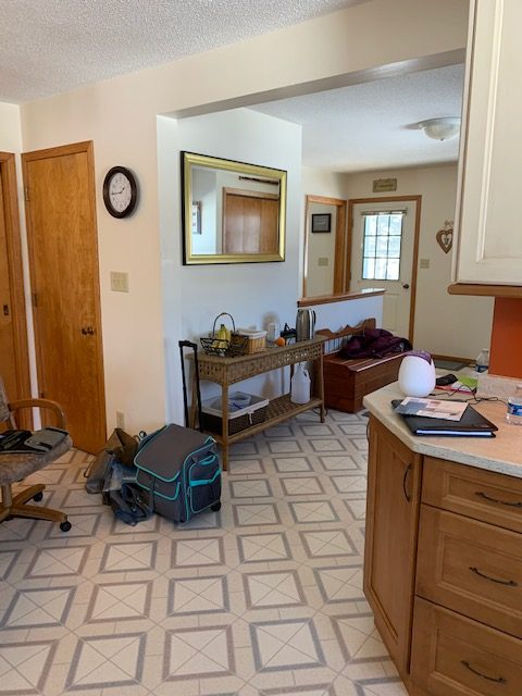
Problem #2: Needs to function better
The client needed this space to have multi-functions and use every bit of room we could.
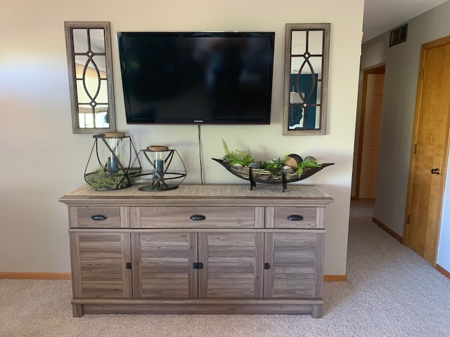
Foyer After Photos

Solution #1: Matched (but not too perfectly) the wood colors
Now all the woods in this small area have something in common, they are all distressed and they are mostly white or off white.
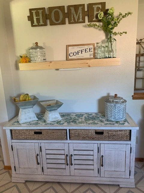
Solution #2: Create a true coffee bar
By adding this multi-function sideboard, the client now has a designated coffee bar and place for her fruit, which was important for her husband. She will put her coffee maker here and have all the needed space for storing grounds, sugar etc.
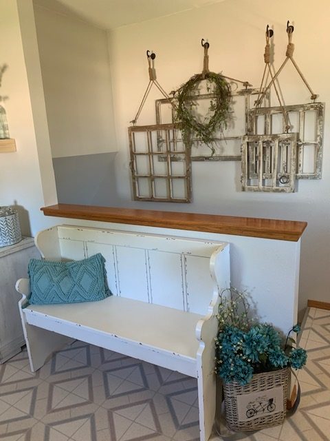
Solution #3: Cohesive farmhouse style
No more bland stairwell and mismatched bench. Now the first thing you notice when you walk in her kitchen is the wonderful welcoming feel the space offers.
____________________
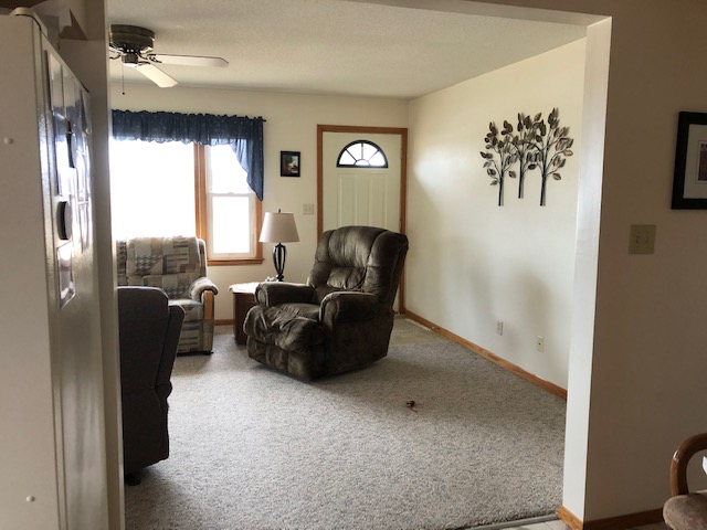
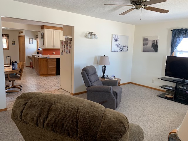
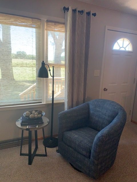
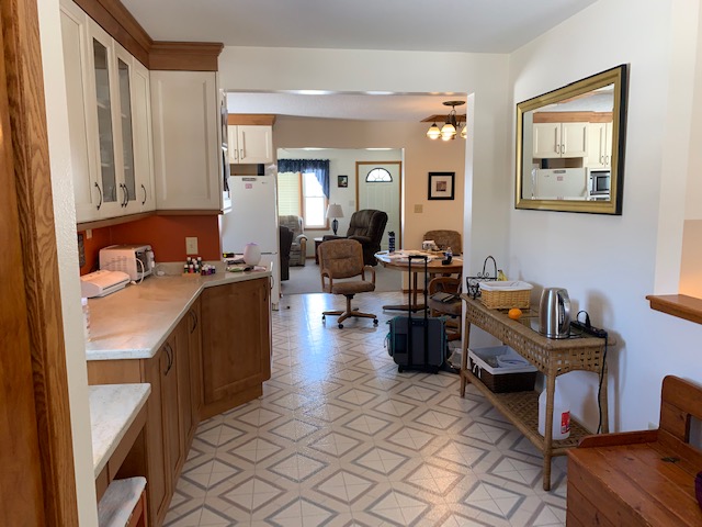
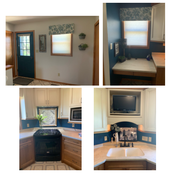
Other PHOTO’s from this project…
And there you have it!
Lots of fun design components and a completely grown up cozy country home.
If you would like to update your home and bring a sense of welcome and peace, I would love to talk with you.
Your first step to hiring me as your designer is to set up a FREE DISCOVERY CAL
CLICK HERE and let’s chat!
Until next time… Design on Purpose!